I don’t plan on using any external audio, I’m just going to read my script. With my image/video I’m using a photo of a digitized face. My script depicts digital writing as the main way that people communicate. So if communication is almost solely done digitally then the way you identify people is as a username, email address,social network name, pretty much as something digital. So the digitized face represents this. I want to add digital communication at the top of the photo. In doing this I’m playing with the idea that digital writing and communication are synonymous today.
Monthly Archives: October 2012
Rhetoric on Town Balance

Posted on Flickr by fauxto_digit
Rhetorical Analysis
This is an advertisement advocating for people to drink Corona Lime. The audience is for anyone who is legally able to drink. Young people are an obvious target as they consume a significant amount of alcohol through binge drinking. Also older people are targeted as the palm tree in the add signifies that drinking Corona Lime is a getaway, a break from life.
Design Analysis
The photo uses the principal of balance. It uses symmetrical balance, if drawing a line down the middle you have the corona on one side and the palm tree and lights on other side therefore balancing the ad. I feel the picture is balanced in a way to show a before and after effect. Drink corona lime and you will feel as if you are in a paradise the palm tree signifies. This meets the audiences needs as alcohol is a depressant and in drinking it you are getting away from what troubles or is depressing you.
AUDIO post card
What is digital writing? It’s The way we express ourselves to loved ones and strangers on social media sites. The way we communicate to one another in the fewest amount of words possible. It is the new innovative way to publish our thoughts on blogs and webpages that gives any and everyone a platform to voice them. It is the way we communicate to our teachers ,govt, employers. In this Digital Age, in 2012, almost all communication is digital writing.
Two Photos Editing
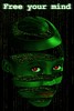
With this photo you have a digitized face. We are what our world makes us. Being that we are a digital world, the way we communicate, do things is done digitally. You identify the person you are communicating with as a user name and email. I would crop out the free your mind and insert something that says a digital message can define you.
Posted On Flickr by Robbert van Der Steeg
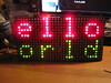
With this photo you have digitized type saying hello world. It represents the new digital world we live in. I would use type art to complete the word and crop out the table.
Posted on Flickr by Nottinghack
I Think I am going to use Photoshop Express to edit my photo. I Have never used it before so I can learn something new. The only photo editing I have done before is cropping family out of photos.
Chap 8 Photo Editing
Key Terms
Photographs- powerful visual images that can evoke strong emotional responses in people
Cropping- is the removal of some of the horizontal or vertical edges of a picture
Flopping- creates a mirror image of the original
Silhouetting- removes selected portions of a photo
Vignette- creates a funky, nostalgic, or dignified look to the image and your layout
Clip Art- pre-drawn art work
Brief Summary
Images have a large impact in getting the intended message to the reader. Aside from making a webpage more appealing, images add impact to the text when used properly. Used improperly, images distract readers from the intended message. For that reason it is important to look for photos that are in good quality and communicate the intended message.
Type as Image is an effective way to bring impact to text.
Photographs, Illustration, Clip Art, and Type as Images are images that can accomplish this feat. Don’t feel that you have to leave a these as are as many special effects can be used to make the image a better fit for the selected text. Some special effects are cropping, flopping, distorting, coloring , custom type, posterizing, drop shadow, and lightening. Just like the images themselves these special effects must be used properly to be effective. With Cropping for example make sure that the shrinking of the image effects its message.
Connections With Experience
Special effects with images are something I have used both improperly and properly. With flopping I once used it on a image of a head to make it seem like that image was facing another image I had on a power-point slide. It improved my message of the two images going head to head. The problem was that that the two images had names underneath the photos and by flopping one of the images the name was now backwards. To fix this problem I cropped out the name on the photo and flopped it. Afterwards I cropped out the image and left the text and created a new photo to place underneath the flopped image. In doing so I fixed the problem. This experience is a good example of the negatives and positives of using special effects to manipulate photos.
Works cited
Graham, L. (2005). Basics of Design. (2nd, Ed.) Canada: Thompson Delmar Learning. 306p. Print.
Ch.2
Key Terms
Accents – are secondary and tertiary focal points because they accent other important points on the page.
Content – the words and phrases and graphics on your page.
Emphasis- states that the most important element on the page should be the most prominent, the second most important element should be secondary in prominence, and so on.
Focal Point – the visual element or part of a page that is most emphasized ad that first attracts and holds the reader’s attention.
Visual Hierarchy – simply refers to the arrangement of visual elements such as type and image on the page according to their order of importance and, consequently, emphasis.
Brief Summary
Pretty much this chapter is about emphasis. It really is for most people an overview on information the already know or do unknowingly. The chapter tells you the proper way to use emphasis and gives examples of what is and isn’t proper use.
Have a reason for using different types of font, using improperly can take away from your emphasis.
Font size and font bold are two examples used as don’t overdo them and make them flow. Also the way you align your page is important, similar to the inverted pyramid in journalism, the chapter says to put the most important information at the top of the page.
Emphasis and C.R.A.P
Emphasis and C.R.A.P. are related. They both deal with the way a website or blog is structured and if used properly provide the reader information while visually enticing them. With both the improper use can lead to the reader not gaining the information they came to obtain.
Graham, Lisa. Basics of Design: Layout and Typography for Beginners. Albany, NY: Delmar, 2002. Print.
Wiki Reflection
In terms of working in the wiki I worked on a wide variety of pages. Ones I was assigned from reading and ones I gained an interest in from reading and replying my fellow classmates blogs on said topics that are part of digital writing. I worked with these select pages.
In reflecting back on my contributions to the wiki, I am most proud of the fact that I worked on pages that I wasn’t even assigned to read and because of this I gained a better feel for what digital writing is. I could have easily just done what I read but that still would leave holes in understanding truly what digital writing is. In terms of my contributions to the wiki I am most proud of the distributed cognition and digital and new media page in that the information I posted makes up the majority the page and my work for the most part stayed the same.While tweaks were made the core is the same and this means that my classmates my peers agreed with the information I submitted. Looking back I wish I could probably further expand on McLuhan. It was one I had to read a couple of times and gain insight from classmates to really get a handle on. So in further expanding on it I feel I could maybe allow the next person who reads him to grasp it the first or second time reading it. McLuhan was again something I was stuck on and I like I said listening to my group members I gained a better understanding of his message. Prior to this class, this semester really I always felt some type of way with regards to others editing my work. Through this project and other courses I’ve learned not to take it personally that my work may have been changed as it is most often times for the best.Other sets of eyes may find other ways to make my message clearer to other readers as my perspective on one set thing is not the same as other people sometimes.
I think four of the course outcomes I worked towards were play, multitasking, collective intelligence and judgement.

As a Class we defined digital writing using collective intelligence
Collective intelligence obviously I didn’t construct this wiki myself and I pooled knowledge with my classmates in order to define digital writing. With judgement it was really trusting the sources I used for my information, either the readings assigned or trusted sites that also helped define an aspect of digital writing. Multitasking I worked on more than one page at the same time and with play this wiki as a whole was something new to me and I had to play with it in order to figure out what I could and couldn’t do.